

BestBuy Vs TheSource - UX Showdown
This case study compares Best Buy Canada and The Source, assessing their online platforms' usability and effectiveness in enhancing customer experience and increasing sales.

About BestBuy Canada
Best Buy Canada offers a wide range of the latest tech products, from laptops to home appliances, all with expert service and competitive prices.

About TheSource Canada
TheSource offers a diverse array of electronics, from smartphones to gaming consoles, emphasizing quality and affordability to enhance every customer's tech journey.
User Persona

Name: Steve Rogers
Age: 93 (Actually 27ish ?!)
Occupation: Unemployed (recently thawed out after being frozen
for over 65 years)
Tech Savvy: Moderately
Smartphone Usage: Beginner
Steve Rogers, a moderately tech-savvy individual with limited exposure to modern technology, wants to explore and effortlessly purchase a new smartphone through a user-friendly and accessible online platform.
Motivations:
• Receive clear and concise product information and explanations.
• Seamlessly navigate an online platform to browse and purchase
the desired device.
• In this case, Bestbuy.ca & TheSource.ca
BestBuy Website Research

Best Buy's Black Friday landing page captivates with its bold countdown, urging customers to take advantage of fleeting deals. The crisp, clear design promises an exciting shopping spree with its eye-catching call to action.
Pros
• The banner leverages a large, engaging image to capture attention.
• Features the best offers front and center, enticing users to shop.
• Navigation is clearly labeled, facilitating easy browsing through different sections.
Cons
• The search bar does not stand out, potentially hindering product discovery.
• The page has a busy layout, which may be distracting to some users.
TheSource Website Research

TheSource.ca's Black Friday page bursts with savings, prominently advertising up to 60% off. The red-hot deals on Apple products are cleverly spotlighted, promising savvy shoppers significant discounts on the latest tech
Pros
• The search bar is prominently displayed for easy access.
• Products are meticulously organized into detailed categories for effortless browsing.
Cons
• The overall design lacks visual appeal, which may not capture user interest effectively.
• The banner fails to make a strong impact, potentially diminishing the urgency of the sale.
User Flows
Task: Buy a Google Pixel 8 Pro

TheSource User Flow
The user flow on TheSource.ca for purchasing a Pixel 8 Pro is convoluted, requiring backtracking to adjust essential choices like color or storage, which disrupts a seamless shopping experience.
BestBuy User Flow
In the world of online shopping, BestBuy.ca stands out with a user-friendly experience. It's not just practical; it's also easy to use and naturally engaging, making shopping online simple and enjoyable.
TheSource Pain Points

Navigation:
The mobile section's redirection showing deals or pricing disrupting user exploration, forcing backtracking and hindering decision-making. Clicking on each model for details, disrupting seamless navigation and comparison, leading to a frustrating experience where straightforward information retrieval becomes unnecessarily complicated.
Pricing:
The lack of clear pricing in the mobile section complicates the shopping experience, leading to confusion and difficulty in making informed purchases. Users navigating the site face challenges in evaluating product value, hindering their decision-making process and overall satisfaction.
Filters:
The filter design's lack of clarity and ease of use leads to a challenging and inefficient browsing experience. Users struggle to efficiently narrow their search, complicating the product discovery process compared to more intuitive systems found on competitor sites.
BestBuy Gain Points
Discovery:
BestBuy.ca's website design skillfully leads users through its vast array of products. This well-thought-out structure simplifies finding and learning about different items, making the process feel natural and straightforward. It's like having a knowledgeable guide in the complex world of online shopping.
Interaction:
The interface is a standout feature, emphasizing simplicity and clarity. Every interaction, from searching products to checking out, is streamlined for ease, thereby significantly boosting user satisfaction. This approach removes any potential stress or confusion, making shopping a breeze.
Seamless Flow:
BestBuy.ca excels in providing a consistent experience across the entire shopping journey. Even when dealing with complex choices like different product models or specifications, the platform's layout keeps the process smooth and engaging, preventing user frustration and enhancing the overall shopping experience.
TheSource ReDesign

TheSource.ca's redesign focuses on smooth navigation and clarity, offering an intuitive mobile shopping experience that delights customers and encourages efficient decision-making without backtracking.
My approach centers on enhancing usability and streamlining the product selection process:
• Filter Optimization
• Mobile Section Enhancement
• Seamless Model Browsing
Filter Optimization

This enhanced design simplifies user’s search, allowing quick filtration to the specs that count. These thoughtful updates are more than just user conveniences; they're strategic enhancements poised to boost TheSource.ca's business.
By streamlining the search process, we not only keep users engaged but also encourage decisive purchasing, fostering a positive UX that directly contributes to increased revenue and customer loyalty.
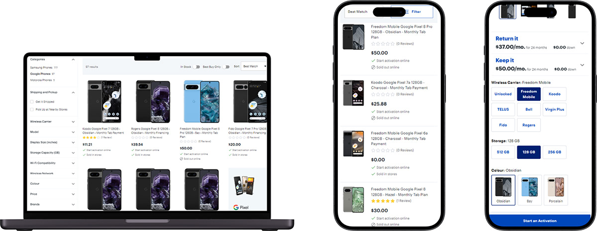
Mobiles Section Enhancements

New mobile section layout highlights deals and prices for swift, informed decisions, ending disruptive redirection and flow interruption.
This change cuts backtracking, improves SEO and conversion, enhances user satisfaction, and turns browsing ease into solid business growth for TheSource.ca.
Seamless Model Browsing

This redesign enhances model browsing and simplifies purchasing paths, enriching the customer experience.
This UX overhaul at TheSource.ca is a strategic move to boost customer engagement and elevate conversion rates, fostering business growth.
Thank You!

This UX study compares BestBuy and TheSource, revealing the real-world impact of UX on business and customer engagement, serving as a guide for digital success.
For a full exploration or collaboration, connect with Sai Kumar Gottapu on LinkedIn.


